Untitled Sans began as an attempt to make another typeface plainer.
Kris Sowersby removed some of the more noticeable details, lost the thread, put the project away, returned to it years later, and nearly threw it out. It was only after reading about Super Normal that he found a way to understand what he’d been making: maybe being deliberately ordinary was enough of a reason for a typeface to exist.
I love that the explanation arrived late. That feels closer to how making usually works: the work moves before the story catches up.
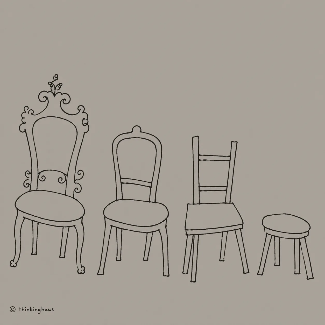
Sowersby describes deliberately removing traces of his own recognizable style from the letters, which sounds almost perverse to my designer brain. I'm encouraged to make things distinctive, ownable, memorable—something that can stand up in a presentation and explain why it deserves to exist.
But most of the time, when I’m reading, I don’t need the typeface to introduce itself. I need it to help me read.
That’s probably why Untitled Sans feels right for both my portfolio and for thinking.haus. The work and the writing can wander around and follow unusual ideas. The letters stay put.
Its plainness isn’t an absence of design. It’s what happens when a mountain of small decisions are made thoughtfully enough that they can recede. The type makes room around the words instead of elbowing them for attention.
I find that deeply appealing: work that has clearly been thought about, but doesn’t keep asking you to admire how much thinking went into it. Work that knows how to be quiet.
Read Kris Sowersby’s notes on the Untitled Collection
Last edited September 2, 2026